2019
Branding / Typography / Animation
Growing up in Kent, l have fond memories of working the orchards during the long summer holidays. This nostalgia inspired me to think about the dwindling orchards in Kent and why growing apples around the farms of my youth had grown out a favour. It inspired me to start collecting apples from friends, family or wherever l could source free apples and start the process of home brewing cider. This is currently a small output affair, but l couldn't resist thinking about branding my output and seeing where it would take me. The work on this page is the result of the odd evening and weekend.
Concept
Underlining the creative direction l wanted to take with the branding was the fable of the Kentish Man, or Man of Kent; a story often recounted to me by my father. It has historic relevance to Kent going back to the Anglo-Saxon period, but essentially is a divide created by the medway river that decrees a person to be a Man of Kent or Kentish Man based on what side you're born on. It's complete nonsense, but l loved the idea of duality and how this would play out in the brand. This firstly inspired the name Flipcider.
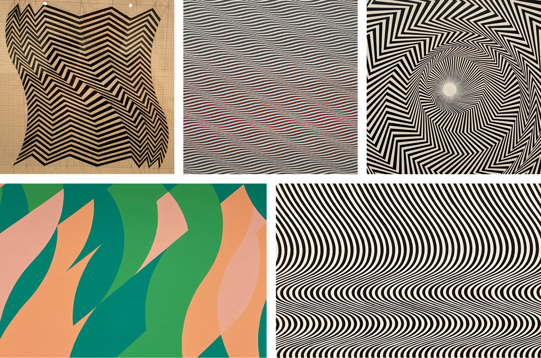
Early exploration centred around this idea of duality and a big inspiration in the creative direction was the work of artist Bridget Riley. The strong use of black and white geometric forms, contrast and tessellating patterns.
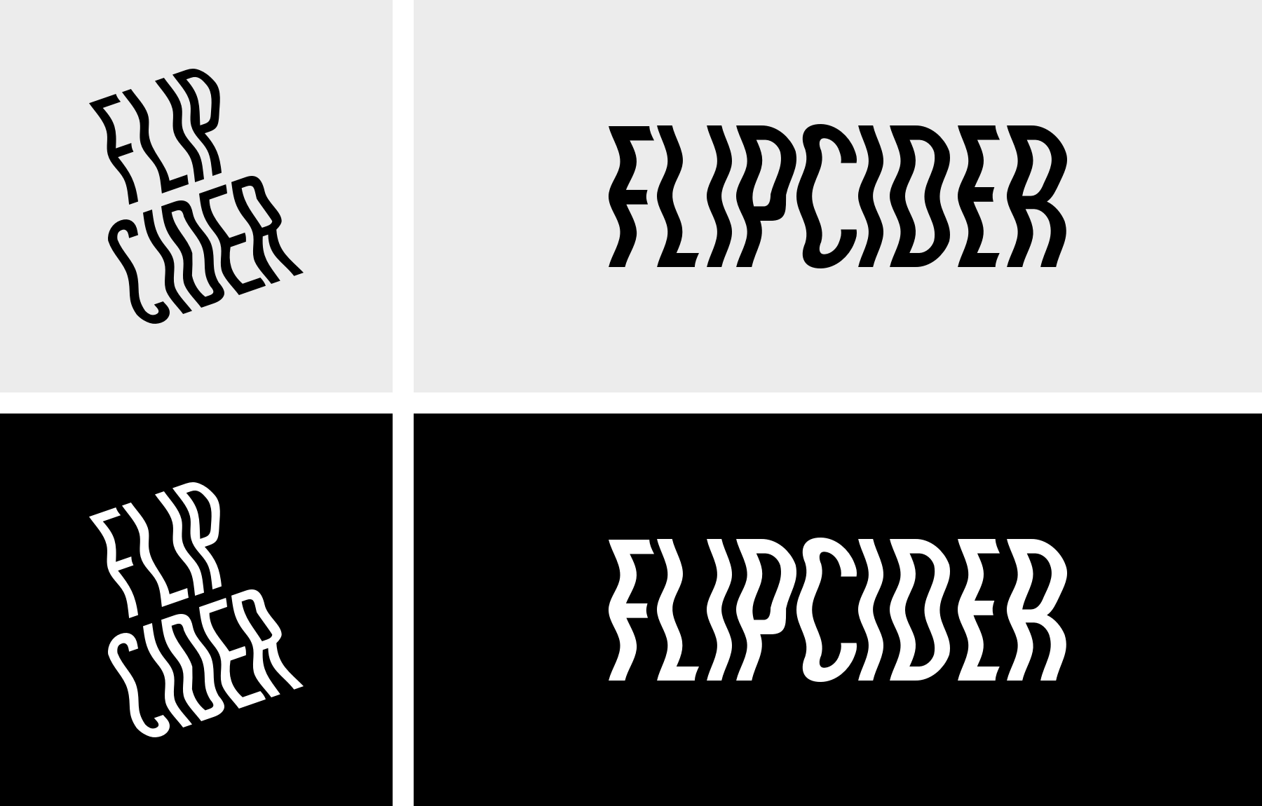
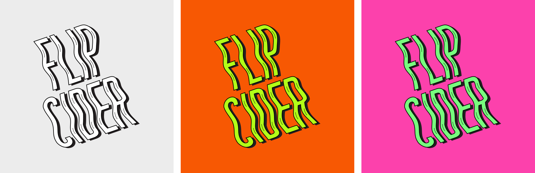
Final logo - Monochrome
To create the final logo l adapted the brand font of Monument Extended by elongating the height of the characters in Illustrator. This was to aid the effectiveness of the horizontal distortion created using the envelope distort with mesh. I felt like the final logo below was my preferred route, as it felt off-kilter, but maintained legibility and clarity.
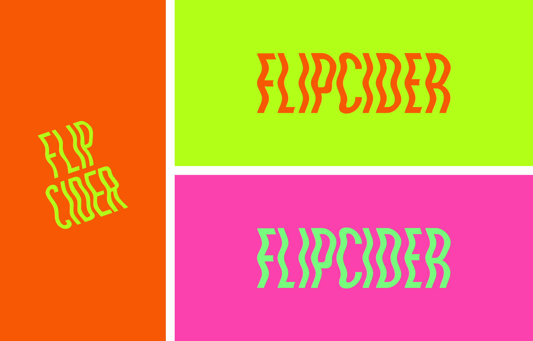
Final logo - Colour
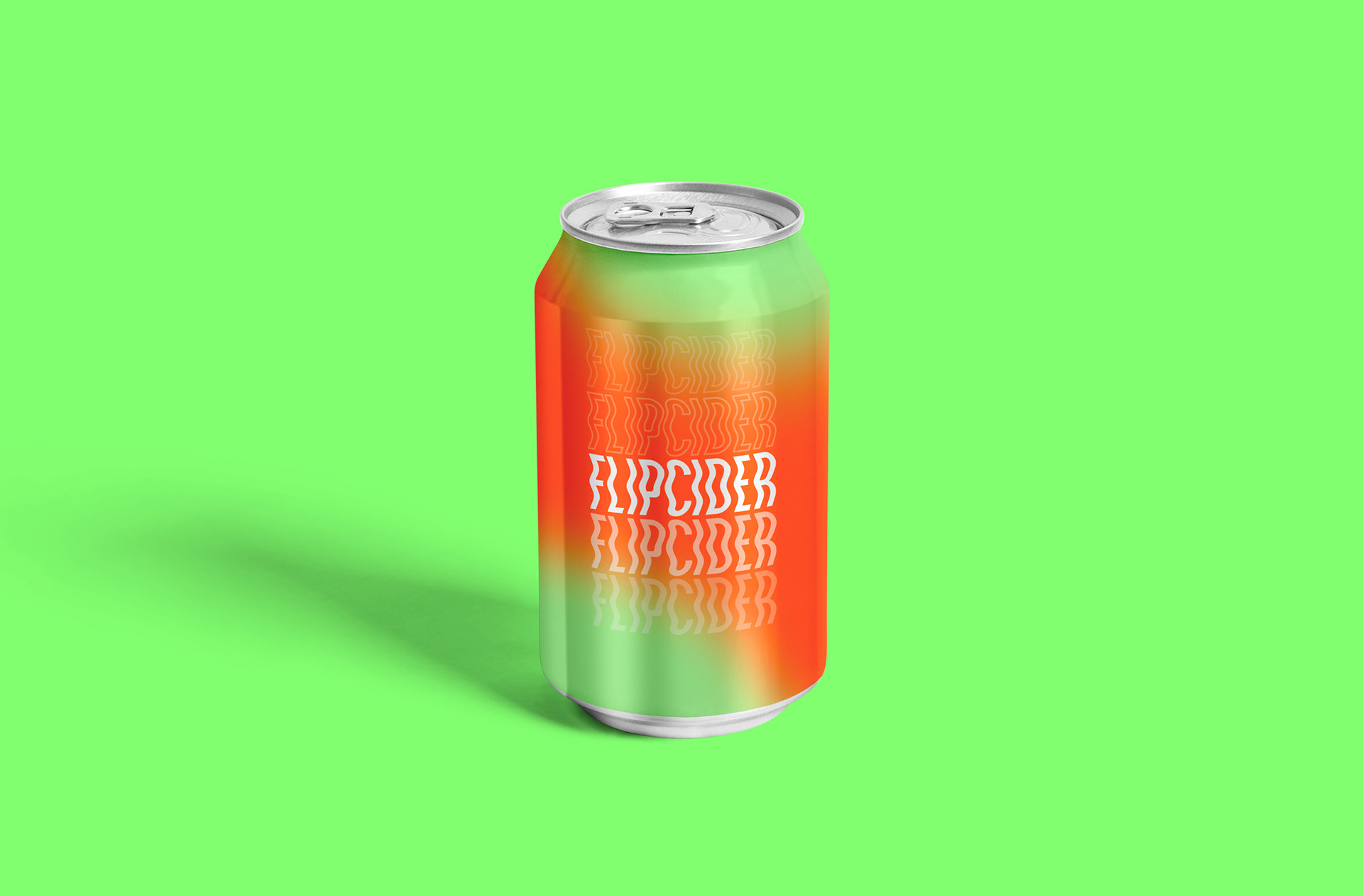
3D option on logo for a more playful treatment
In trying to make a mark that had flexibility l tried these more tactile, embossed versions of the logo to see if there was a way to dial up or down the mark dependent on product. I was pleased with how more playful it could become.
Typographic Animation
Early in the process of designing the logo l wanted to think about how the brand, particularly the logo/mark would come to life with animation. I created these experiments using After Effects and explored distortion techniques to see if any interesting patterns could be created that would influence the final logo. I also like the idea that the using the elongated Monument extended font l could have a mark that was flexible to change with the connecting factor being duality and distortion. The creation of a brand that felt connected by being off-kilter or the other worldly.
Typography

Colour palette
The colour palette is work in progress at the moment, but my intention was to make the brand feel different to other cider brands by using a very distinctive, almost neon colour palette. Each set below was created on the basis of the main opposing pigmentation in apples, green and red. However, they've been pushed to different colour ranges and are currently being used for different variations of the cider l am making. The purple for sparkling, the red and green for classic still, and the yellow for a blended cider that includes pineapple.

In situ
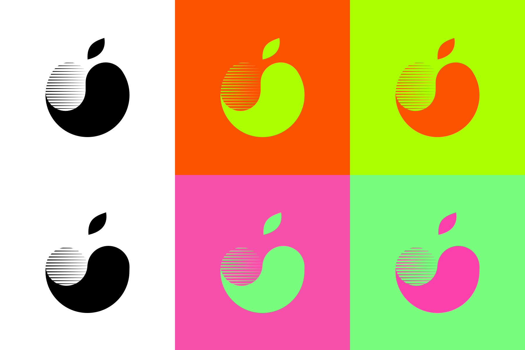
Rejected logo route - Yinyang
Initially l explored the idea of creating a mark inspired by the duality of the Yin and Yang symbol. I wasn't pleased with the result though, as it inadvertently started to closely resemble another well known apple-based brand.
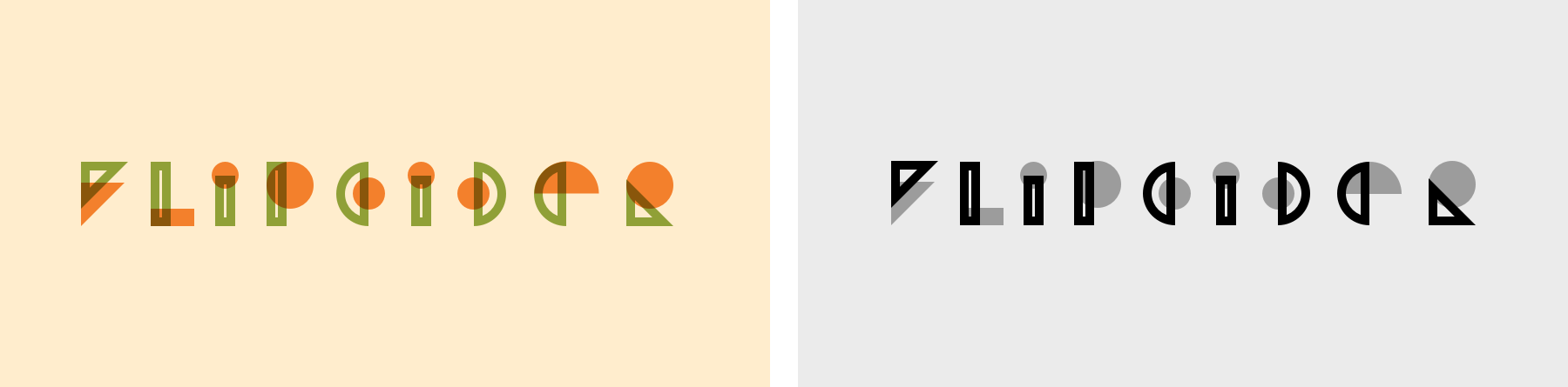
Rejected logo route - Abstract custom font
I created this type set at the beginning of exploring the logo mark creation as l liked the duality of the relationship of the characters that had a stroked shape with a fill. Although l think the abstract nature of the type forms was interesting, l was ultimately concerned about legibility to pursue further.